 2026
2026
The brief: Three customer typesThe real problem: Five lives under the labels
Navigation that adapts to who you are
Vattenfall's three customer archetypes hid five different lives. I turned a two-year-old navigation vision into a validated prototype and a hi-fi redesign: one structure, with content that adapts to each.
- Client
- Vattenfall
- My role
- Lead Designer, Navigation Vision
- Period
- 2026
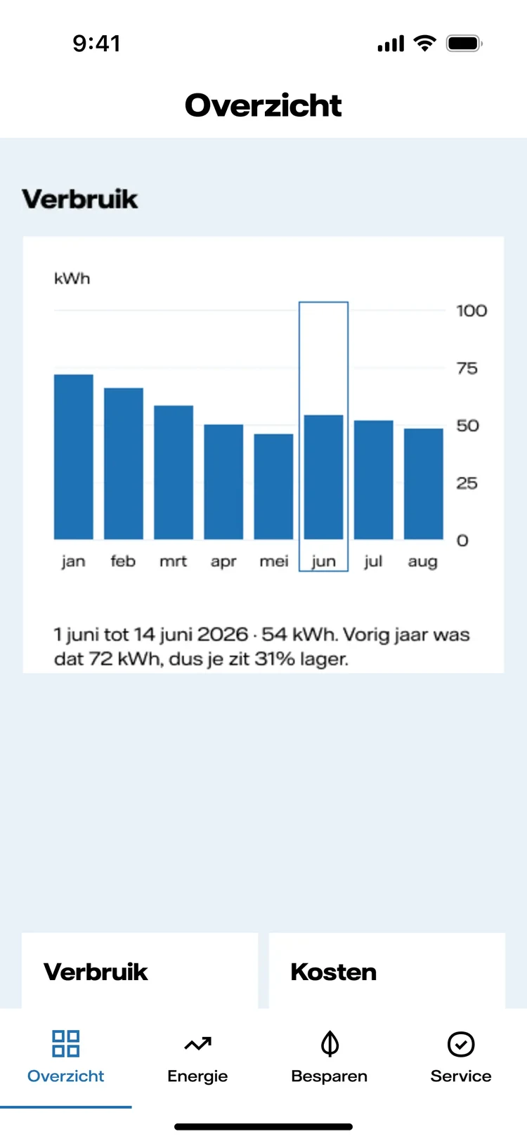
One structure, three homes.
Details from the design, at reading size.
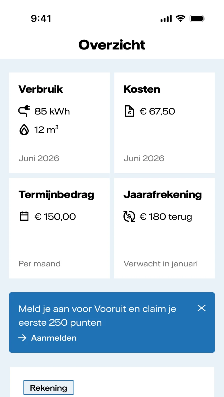
No devices yet
Usage, costs, and the bill come first, with no picture of equipment the home does not have.
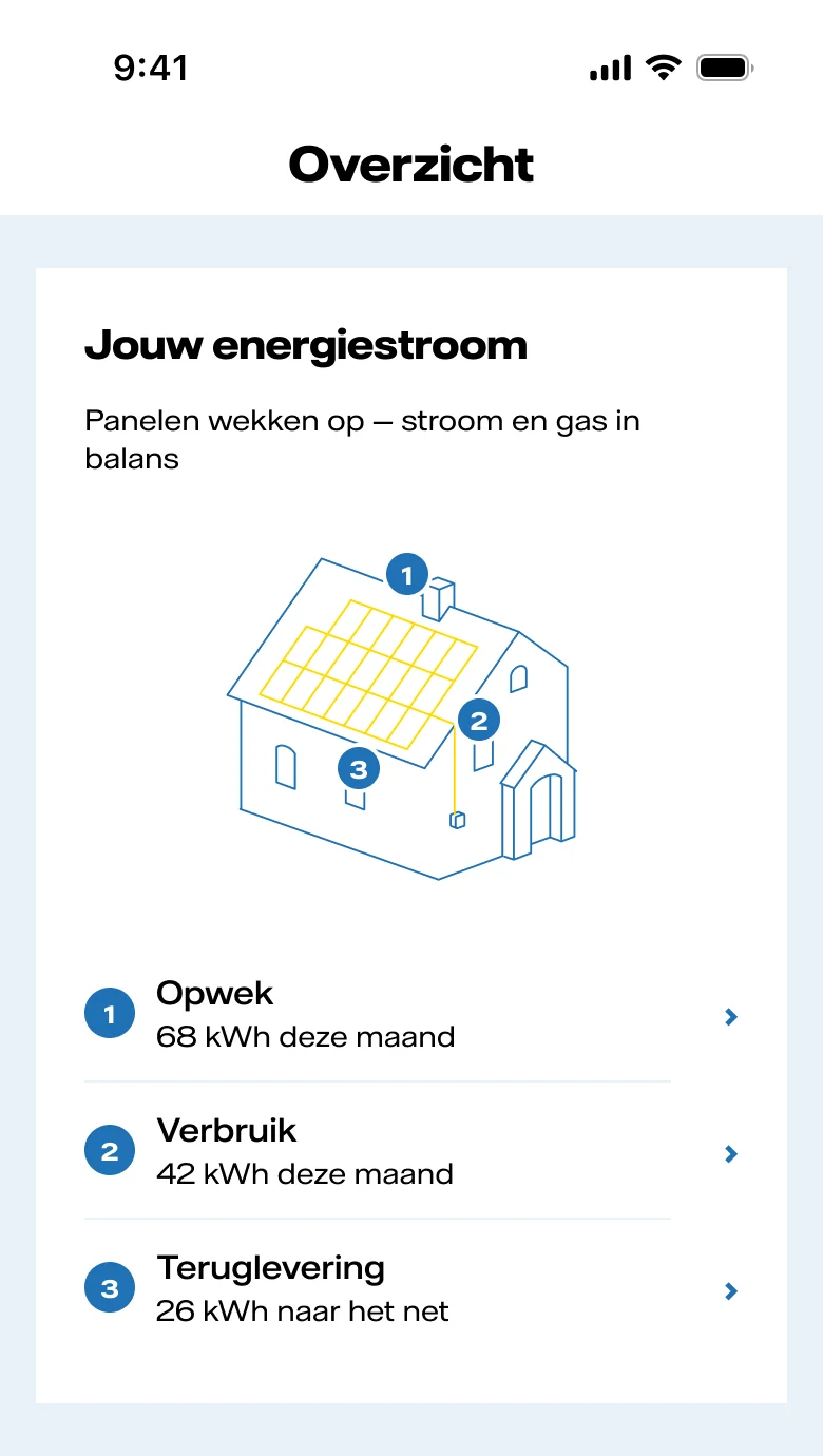
Solar panels
The same screen opens on the home’s energy flow: generation, use, and feed-in.
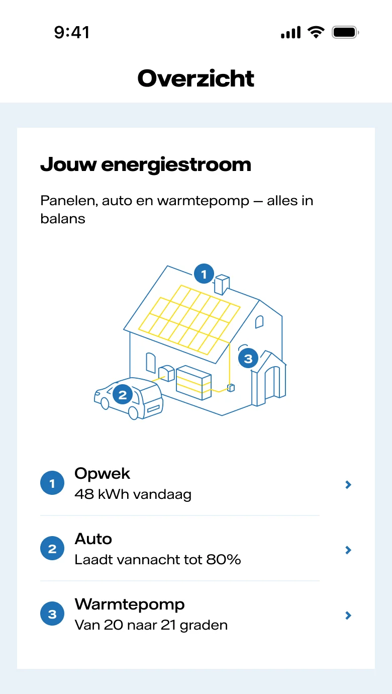
Panels, car, and heat pump
The flow grows with the home: charging and heating join in, the structure stays the same.
The problem I was handed
Vattenfall's app and web environment serves roughly two million Dutch customers, from renters with a single energy contract to households managing solar panels, a charging point, and a battery every day. The navigation was built for the first group. The assignment: develop a two-year-old navigation vision into a validated prototype, on a hard deadline, so development teams can plan the build with confidence.
The problem that was actually there
Vattenfall had identified three customer archetypes. Within days it was clear that two of them each held two very different people. The first mixed renters, who cannot add solar panels or a heat pump at all, with homeowners who simply have not yet: people worth helping take that step. The third mixed sustainability enthusiasts, who want to see and tune everything, with people who bought a new-build home that came with seven apps for its solar panels, heat pump and charging point, and who just want it all to work.
Five lives under three labels. On top of that, the inherited concept carried two years of research that had never been stress-tested against its own raw data.
What I did
Made the concept testable in the first week. Every implicit assumption went onto an assumption map, ordered by risk and confidence. I recalculated the existing benchmark study against its raw data before trusting it, which surfaced the sharpest inconsistency in the pre-work and made it an open test question. Then a validation plan under time pressure: qualitative rounds first, a quantitative round against the benchmark after.
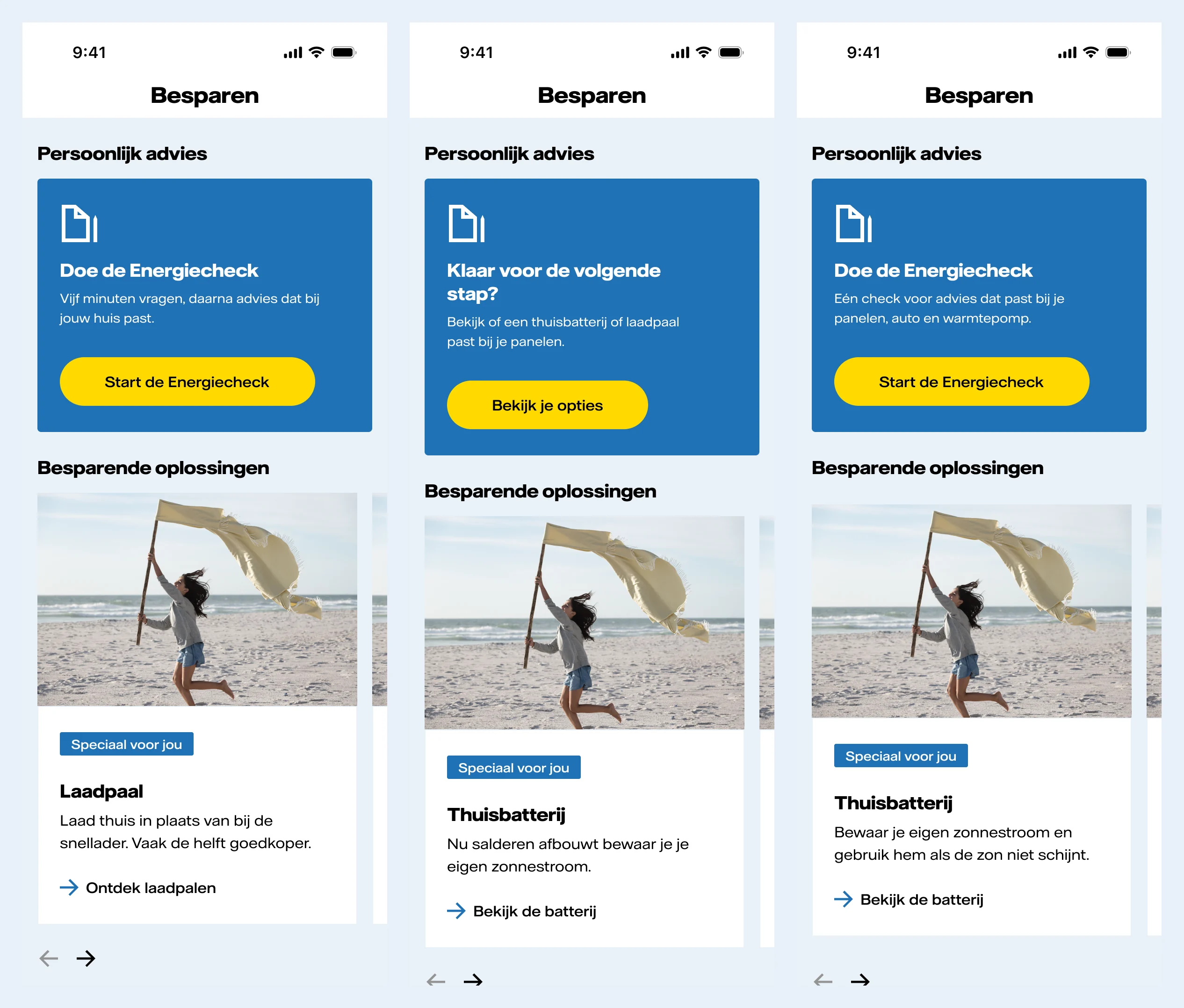
The design direction: one structure for everyone, with content that adapts to each of the five. The early sketches had good ideas that did not work for everyone. A home that shows its solar panels and charging point delights someone who has them; a renter who keeps seeing “add your solar panels” only gets FOMO. So what the home screen shows depends on what you can actually change.
The sharpest choice: design first for people who cannot install devices, and for new-build buyers drowning in apps. The energy enthusiast already lives in specialist tools.
 View full size
 The result
Delivered: a validated prototype and a hi-fi redesign, ready for the development teams to plan the build. A final qualitative round with twelve customers tested what mattered most, and they were very positive that the app matched their own situation.
What this shows
Leading design on structural change, evidence discipline inside someone else’s two-year-old concept, and seeing that three segments were too few once you look at who can actually change their home.