 2025–2026
The brief: Need guest modeThe real problem: Make parents feel safe
De Grote Speelgoed App
Research that turned the roadmap. Parents feared their child could buy something; the login was simply where that fear showed.
- Client
- bol.com
- My role
- Senior Service and Product Designer
- Period
- 2025–2026
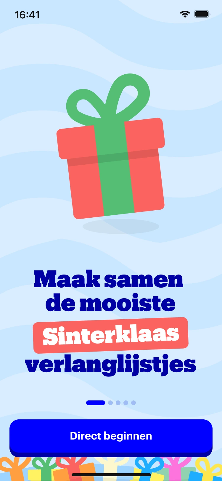
Family onboarding.
Details from the design, at reading size.
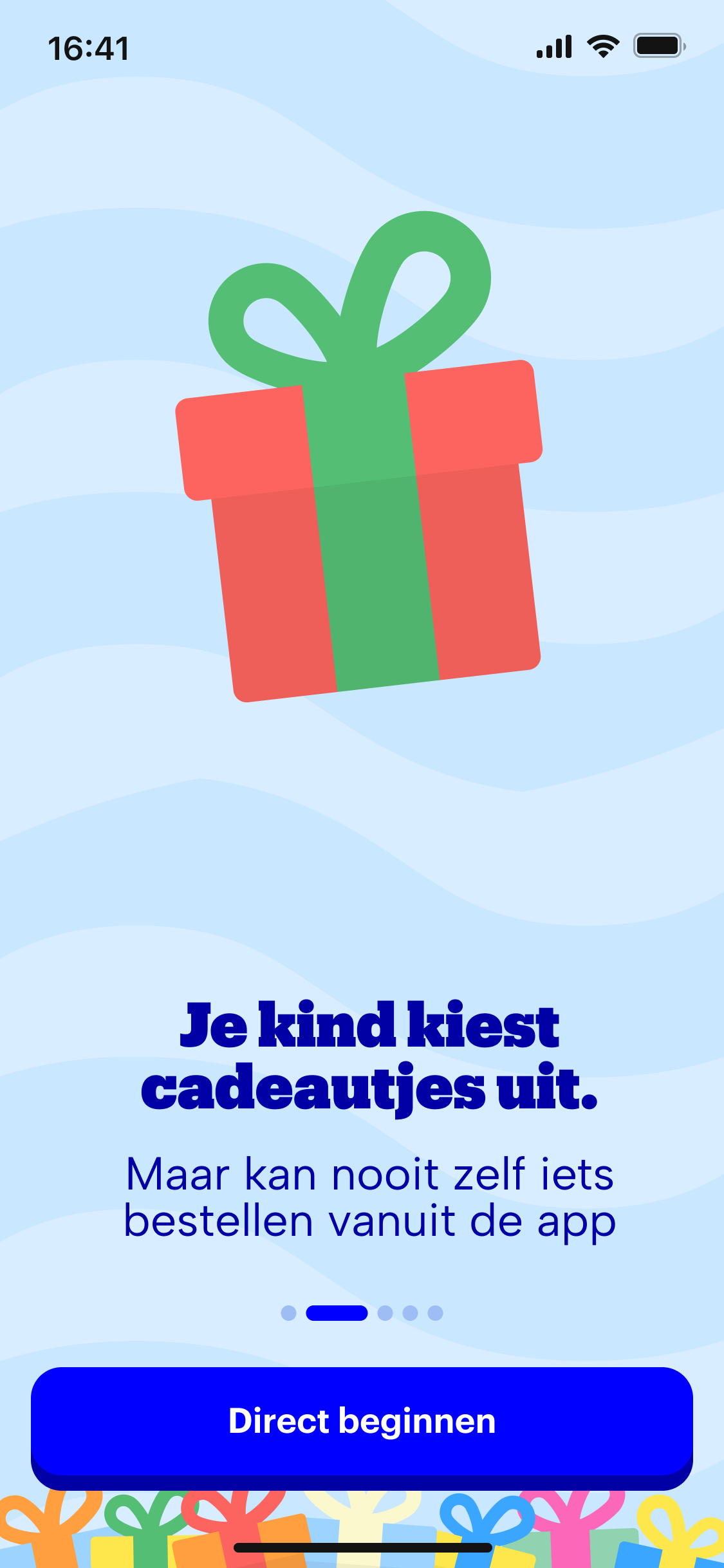
A clear promise
The introduction explains that children can choose gifts but cannot place orders themselves.
An invitation to begin
A prominent start action follows the reassurance, with progress dots for the introduction.
The problem I was handed
bol.com's toy wishlist app for children lived and died with the Sinterklaas season. Usage collapsed every January, and the team wanted to know if year-round value was possible. A solution was already on the table: build a guest mode, because users were dropping off at login.
The problem that was actually there
I ran eleven parent interviews in two days. The drop-off happened before login, at the mandatory onboarding video. The fear behind it was specific: nine of the eleven parents named the same one, their child accidentally buying something. Meanwhile parents were already keeping year-round wishlists in WhatsApp, Notes, and bol favourites. The need existed; the app was losing to workarounds.
What I did
I pushed back on the guest mode with the interview evidence and proposed cheaper fixes that make the safety visible before asking for a login. Then, as a consultant, I took the concept through to a delivered proof of concept and laid the foundation for the rebuild: an 83-row service blueprint across four personas, a redesigned onboarding (look around first, log in at real actions, a clear promise that the child can wish but never buy), a quantitative research brief, and a beta group of parent colleagues.
And a manifesto: no dark patterns, no FOMO, the screen as a bridge to physical play. As a father, that one mattered most to me. A children’s app should never nudge a child, and the team still works by it.
The result
The concept became a funded product. The first feature we built was the bridge between paper and screen: scan a block in Het Grote Speelgoedboek and the toy appears in the app, ready to wish for. Production data from the following season confirmed the reframe: linked accounts are four times as active, but forcing the link up front fails. The recommended fixes were the ones the research pointed to: let value come first.
What this shows
Research that changes a roadmap, pushback backed by interview evidence, and the judgment that friction in the right place builds trust. Guest mode would have removed the wrong friction. Handover discipline too: the incoming designer asked me for a Definition of Done, so new designs still get checked against the research after I left.